When the three founders of 3 Kaveria (“three friends”) were designing their first products, they created quick prototypes of the packaging and took these to the freezer aisle of a store to test them in context. This testing led to a crucial turn:
“When we started to develop these, we had a white tub and a white lid. We thought about taking a bunch of magazines and then cut all kinds of phrases and pictures, pictures of cows and everything, and then we glued them on and tested what they look like. We took a drawing of three friends, someone had drawn three friends, and put that there. Then we took the prototypes to the store, this supermarket with a shopkeeper we knew, we took them there and asked if we could test what the empty tubs look like in the freezer. We put them amongst the ice creams in the freezer, and the shopkeeper wife came by and asked who on earth had put yogurt tubs in the freezer. It didn’t quite pass the test.” – Heikki / 3 Kaveria
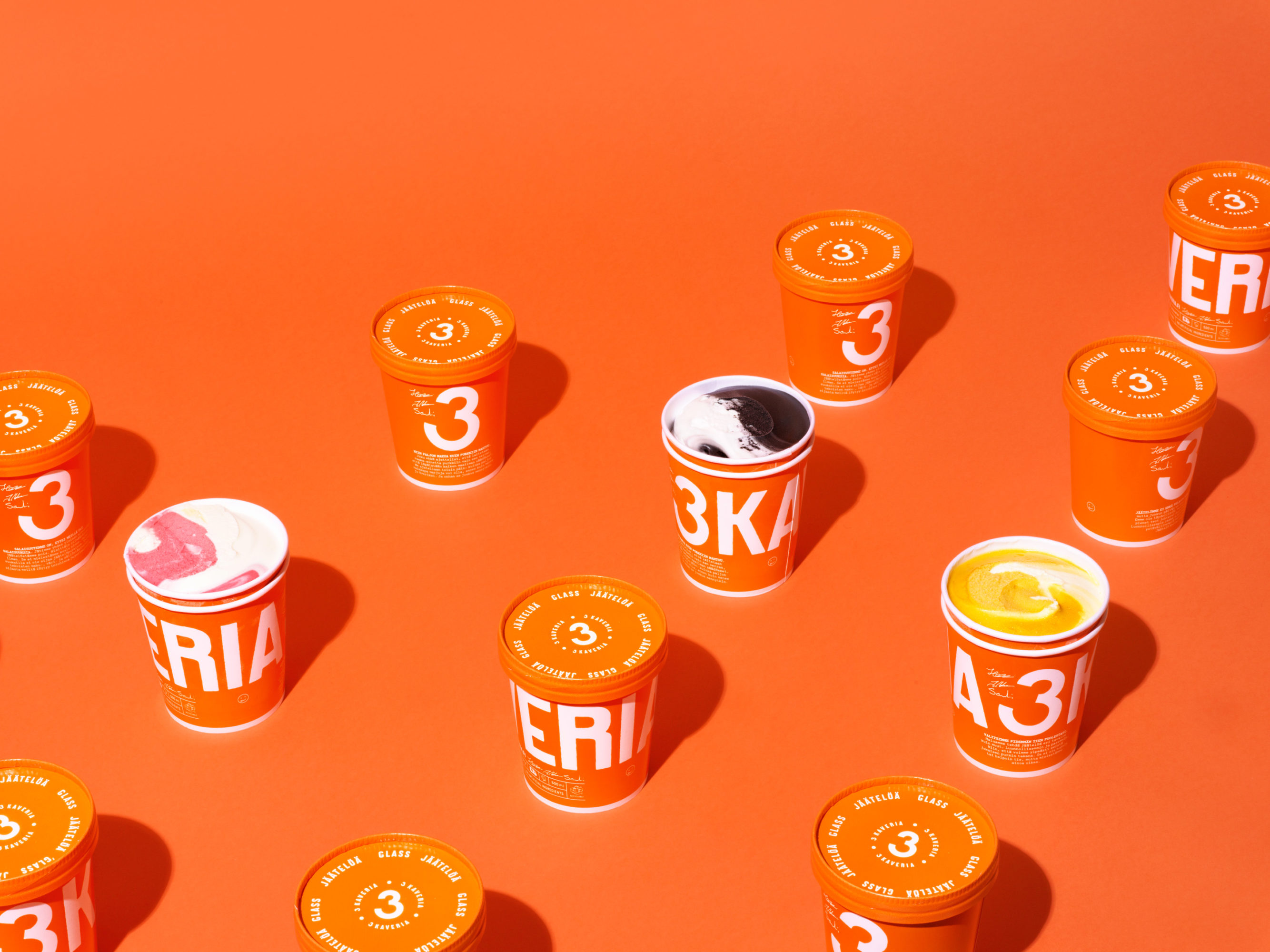
Standing there at the store, the founders realized that virtually all ice cream brands on the market at the time were white, had an image of a cow or were cramped with text. The idea of using a number 3, as a cornerstone in the brand and name, was born. One of the founders recalled seeing something orange that had really stood out, and suggested that for the new packages. A second round of prototyping ensued by heading to the hardware store to buy all of the different tones of orange in stock and painting empty tubs to see what they looked like. Then placing them all in a row to cut down the options to a viable few.
Armed with these new prototypes, the three founders headed back to the freezer aisle. The results were immediately clear: “This was the only package in the freezer that was orange. You could see them from miles away. No other package stood out.” The orange stuck with the brand. One of the founders told a story about a friend who had picked up a raspberry ice cream tub from the store while traveling in Sweden. He had only realized in the hotel room that the name had been changed to the Swedish 3 Vänner from the Finnish version. The orange package with the pink seal itself was distinctive enough to ignore the need to read the labelling and choose a favorite.
DesignBites is a multidisciplinary Aalto Design Factory research project investigating the needs and practices of experimentation and design work in food and beverage startups and SMEs amidst their internationalisation efforts. During the first year of the research project, we’ve focused on Finnish startups food and beverage ventures, tracking the development activities of 17 companies ranging from premium food and drinks with local ingredients to creating new markets and consumption patterns. In 2019, we’re broadening our view to different ecosystems across the world. Follow our journey from: Twitter & Instagram