Andreas Dahin writes about what makes a good – or bad – poster in science communication.
by Andreas Dahlin
Poster presentations and academia are inseparable, it seems. Let’s contemplate for a moment what a poster is. What is its purpose; what are its functions? Many of us might say that it is
- A poor substitute for an oral presentation
- A useless piece of paper nobody cares about
- Something the organizers need to increase the number of participants
- A waste of time
Think about it for a minute. Even if we regard posters in this negative fashion, we still walk around the halls during the poster session since we know that interesting results and findings often hide behind – let’s face it – rather messy and ugly poster designs.
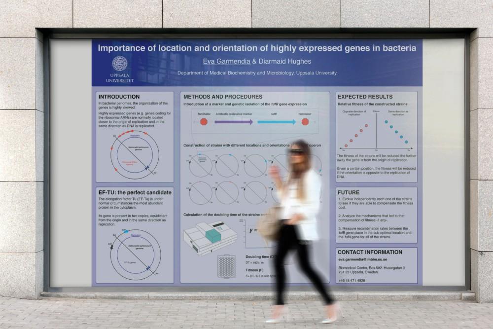
Imagine yourself at the next conference, strolling around the poster presentation venue when suddenly, you see a poster that immediately attracts your attention. You stop there for a minute and you find yourself just reading through the poster and getting some really interesting information that sparks your inherent curiosity about science in general. 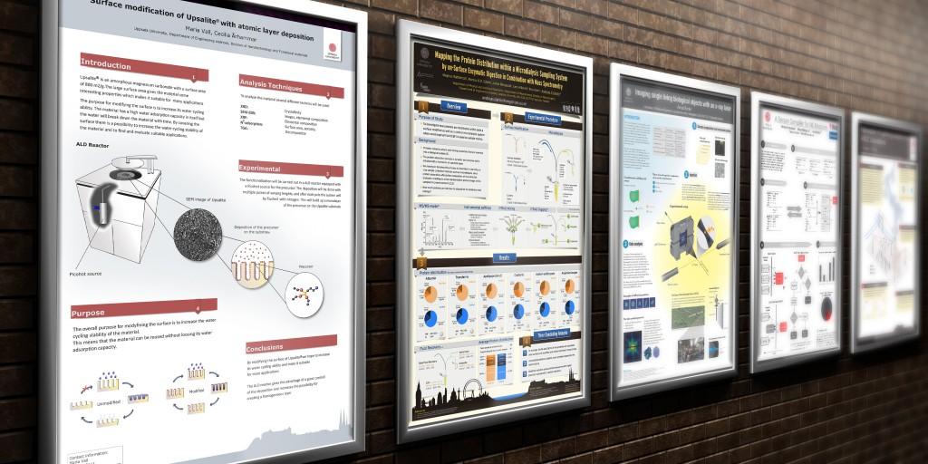 Inspired by the unexpected, you decide to talk to the presenter and to find out more about the work and perhaps also give some suggestions for improvement. However, the presenter is already surrounded by lots of people that seem to be excited about the research. You decide to go there a little bit later and grab a coffee in the meantime. You meet some of your colleagues and they are also talking about the poster. So you all decide to go there again and talk to the poster presenter.
Two weeks after the conference you are asked to summarize the content of the conference to those of your colleagues at your home department who could not attend. You tell them about the great poster and then have to go back to your notes to check what the oral presentations had been about.
So what actually happened at that conference? Why did you find the results and conclusions of that poster so interesting, especially as these were not even within your own field of research? You had, in fact, encountered the perfectly designed poster which followed the codex for good design: such design which
- Captures attention
- Controls eye movement
- Conveys information
- Evokes emotion.
In addition, the poster conveyed only one message, had a great structural design and finally, appealed visually to the eye.
The abovementioned poster is pretty exaggerated; there are no such “super posters” out there. However, if you can design a poster that is half as good as the “super poster” you will outshine your neighbouring posters, attract lots of audience and get lots of questions from researchers not only in your field. As a result, you will improve your work, expand your network and increase your chances of getting published in a high-ranked journal.
There is a great opportunity within almost all branches of science to really shine in the poster session. Most scientists are not too excited about making a poster since it involves advanced designing and software skills, and a lot of time and courage go into producing it. The return is often meagre: a couple of polite questions from an old friend at the conference. It is simply not a good deal.
But here is the good news. The advanced designing skills are something you can learn. Same goes for software skills. Even though the first poster will take you quite a lot of time, once finished, you will have no problems or confidence issues with presenting your poster. One way to start is by joining a one-day poster workshop held at the Design Factory on the 7th of April, free of charge. Sign up and find more information at http://visualizeyourscience.com/winning_poster/
About Andreas Dahlin
Andreas Dahlin has a PhD in Analytical Chemistry, Uppsala university from 2005. He has always been interested in presenting science with high quality, pedagogical images. His images have been published in more than 40 doctoral theses, numerous articles, as graphical abstracts, and as journal covers. In 2011, he started a PhD-course at Uppsala university with the name Visualize your Science where he shows tips and tricks on how students could visually communicate their research more effective to both general audience and peers. So far, more than 25 students have won poster prizes in international conferences.